HeatSheet: A UI/UX Design Study
A hot sauce buyers guide and community rating system. Designed to provide an unbiased review on your soon to be favorite condiment

This case study aimed to test my knowledge of Figma while focusing on my empathetic intuition and problem-oriented development skills on the User Experience side of UI/UX. I tried to go through all the necessary steps to familiarize myself with the process.
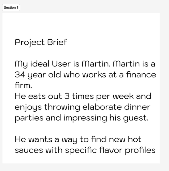
I started my case study by developing a project brief, a theoretical user profile that acts as a guide. Using this brief, I can identify my users' needs and the emotions tied to their inherent problems that my app aims to fix.
Next, I developed an empathy map to understand these feelings. This tool is useful in articulating what we know about a particular type of user. It externalizes user information to create a map of their personality and mindset and aids designers in making informed decisions.

From my empathy map, I determined that Martin cared about three important things:
1) Finding and purchasing unique hot sauces with convenience and ease
2) He trusts and values the opinions of his peers
3) Understanding the quality and flavor profile of a sauce before he spends the money on it
With these three goals in mind, I aimed to develop a community "almanac" of hot sauces. This platform would allow users to discover, purchase and rate their hot sauces.
Because the reviews and flavor profiles are community-generated, they give the customer a more honest, layman's assessment. With HeatSheet, Martin and other users can search for new hot sauces and receive an unbiased opinion of their prospective sauces.
Heat Sheet aims to be a community-ranked hot sauce index. Users of the site can discover new sauces based on a specific flavor matrix, purchase the sauce, and rank it. This would give new customers a better understanding of what a new sauce may taste like/what foods to pair it with based on previous experience. It would also provide a less biased take as average people rank the sauces, not the company spokespeople.

With my user's emotions and corresponding needs, I developed some rough sketches to understand the visual hierarchy of my application. These sketches help me understand the flow of my user's interactions.
Using my sketches as my outline, I began to construct the different pages of my application. I developed a simple library of sauces, filter, and checkout screen.
I wanted to incorporate a banner-style marquee and utilise the prototyping features of Figmas to give my site a realistic experience. This way I could visualize the interactions of my users.
One of the elements I wanted to incorporate throughout my application was a slider. This slider can be seen in the filter and the sauce description slides. It would also be present in the ranking page to create a sense of cohesion between the pages. I chose to use the slider to give the users a feeling of how hot something was as a number scale felt too scientific for how oily or spicy different sauces were


After completing all the frames, I set to create some realistic mockups. This would help tie my project together and present it in a realistic format.
I generated screen mockups using the iPhone 15 bezel and arranged them into the above format. Finally, I embedded the figma code into the framework of my portfolio, allowing users to play around on HeatSheet.
Overall, I think this project was a great success. I was able to transfer a lot of my prior knowledge and experience into Figma, learn some new skills like prototyping and creating interchangeable components, and strengthen my understanding of problem-based development through empathetic positioning.